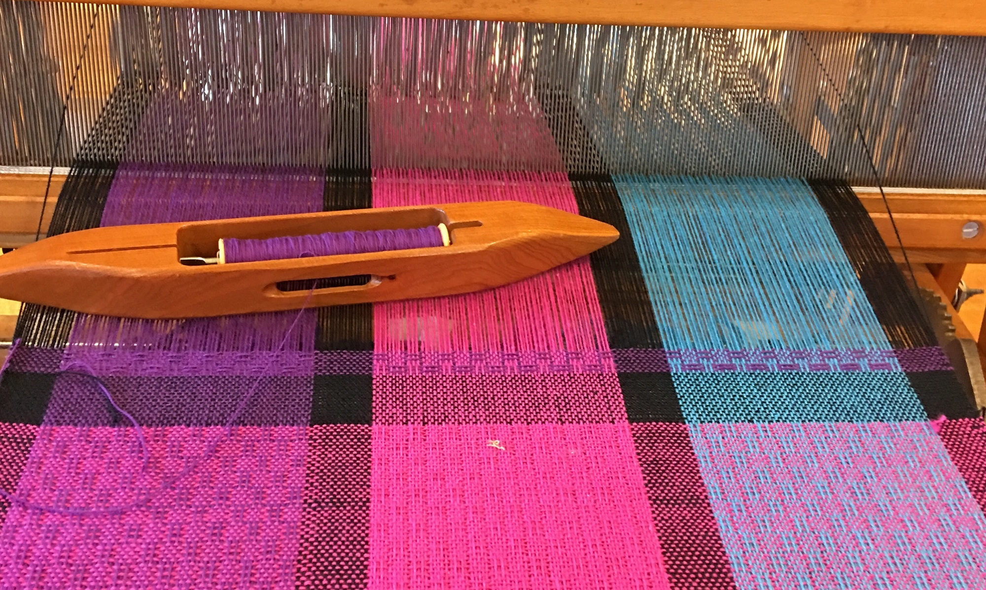
I am pretty sure I have decided on Bumberet for the structure of my next set of towels. Bumberet is a textured fabric with a ribbed appearance and plays well with color.
Color is always where I struggle. I know what I like, but I have trouble knowing if they “go” together with an artist’s eye. I was never good in art class; I guess I never found my medium. Crayons and paint never spoke to me the way fiber does. I have learned to trust more that what I like usually turns out fine. The color workshop I took at the weavers guild in the fall helped a lot to convince me to trust my choices. I have a few tools I lean on such as a color wheel and the computer.
I uploaded a picture of a beach volleyball game that I took in May and used an online tool to help pick out colors. I chose to select the medium blue color as the color I would choose to coordinate with. I also thought I would put the suggested triad colors in. I didn’t have a limey green so picked a turquoise (one of the other colors in the generated palette) to be part of the triad with the blue and fuchsia which I had in my stash. I also picked a gold to make the split complement. I think 4 colors is plenty for the warp, but may play with adding a neutral tone in there too.
Then I looked to my other colors of 8/2 cotton for weft colors knowing that I wanted to weave towels with only one shuttle for weft. I like to keep the weft in darker values to liven and help the warp colors pop. If I chose white or light pastels they would wash out the warp colors. You can see how the gray in the last image washes it out a bit. I changed the weft colors around to see what each looked like. I chose black, navy, purple, then a lighter blue and gray. My favorites so far are the navy and the purple. What do you think?


